
Best font for a catalogue: pick two and change them
The best font for a catalogue is one that is easy to read on a phone. Pick one font for headings and a plain one for the small text. In CatalogLeaf you set both once, and every page changes together.
Imagine you sell vases from home. You make a catalogue and use a curly font for everything. It looks pretty on your computer. On a customer's phone, the prices are hard to read.
If you search for the best font for a catalogue, you find long lists. You do not need a long list. You need two fonts that are easy to read. This guide shows which ones to pick and how to change them in CatalogLeaf. Our example is a small vase shop.
What you need:
- A catalogue open in the editor. Click Customize after you create it.
- Two minutes to look at your page on a phone-sized screen.
Which font is best for a catalogue?
The best font is the one your customer can read fast. A catalogue is mostly small text: names, prices and short notes. So the small text must be plain.
CatalogLeaf has 8 fonts. Each one is marked with its kind:
- Inter, Poppins, Montserrat (Sans): clean letters with no small feet. Good for prices and product notes.
- Nunito (Rounded): soft, friendly letters. Good for kids' shops and gifts.
- Playfair Display, Lora (Serif): letters with small feet. They look classic. Good for jewellery, saris and home decor.
- DM Serif Display (Display): a strong, heavy serif. Use it for big titles only.
- Pacifico (Script): it looks like handwriting. Use it for one or two words, never for prices.
A simple rule: use a serif or display font for headings and a sans or rounded font for the small text. Two fonts are enough. Three or more make the page look messy.
Fonts that suit your shop
| Your shop | Heading font | Small text font |
|---|---|---|
| Jewellery, sarees, home decor | Playfair Display | Inter |
| Vases, candles, gifts | DM Serif Display | Nunito |
| Kids' clothes, toys | Nunito | Poppins |
| Electronics, tools | Montserrat | Inter |
| Cakes, sweets | Lora | Nunito |
These are starting points. Look at your own photos and choose what feels right.
Step 1: Find "Catalog style"
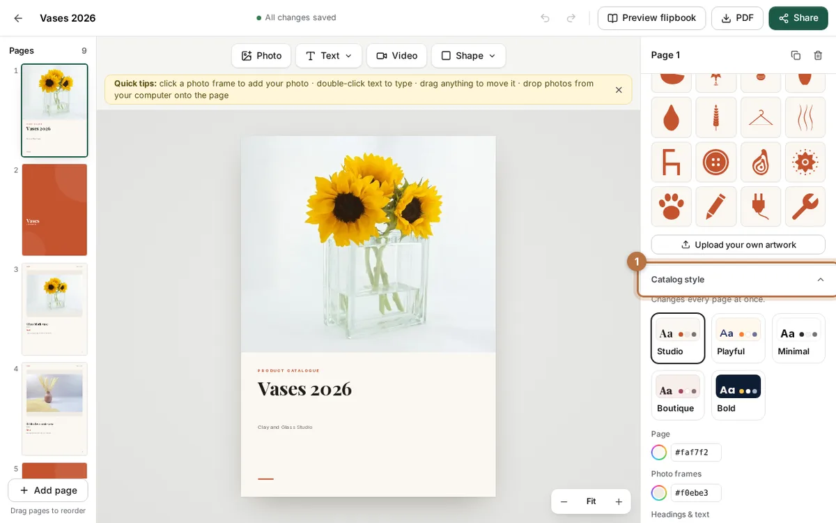
Open your catalogue in the editor. Click an empty part of the grey area, so nothing on the page is selected. The right panel now shows settings for the whole catalogue.
Scroll down to Catalog style. It says Changes every page at once. That is what you want.
Step 2: Pick the heading font
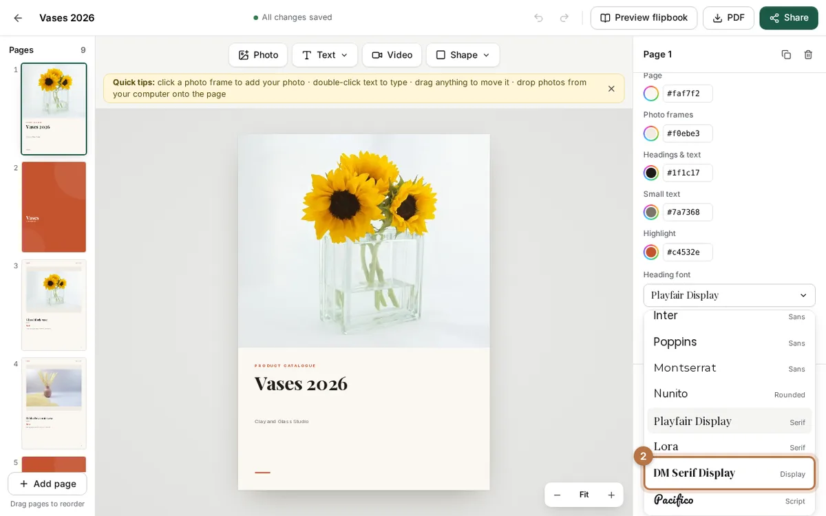
Click the box under Heading font. A list opens. Every font name is written in its own letters, so you can see how it looks.
Click one. We chose DM Serif Display for our vase shop. The titles on every page change at once.
Step 3: Pick the body font
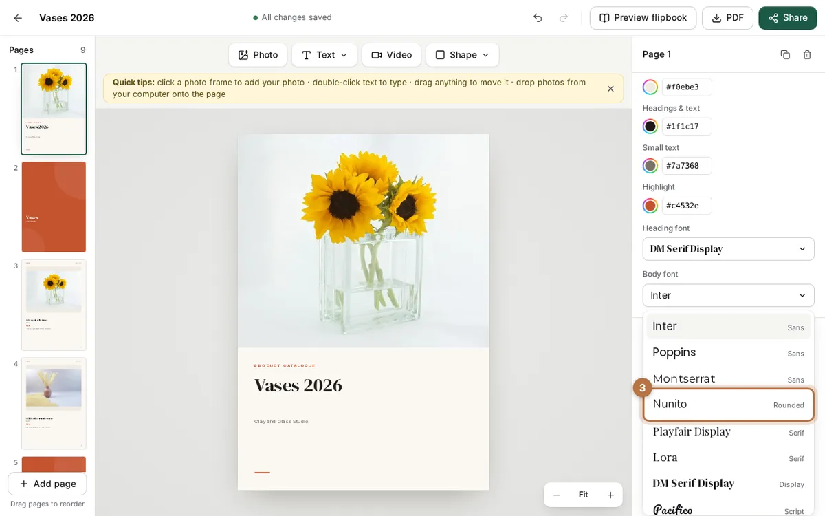
Now click the box under Body font. This is the font for names, prices and short notes. Choose a plain one. We chose Nunito.
Check the preview. Can you read the price easily? If not, try Inter.
Step 4: Change one text only
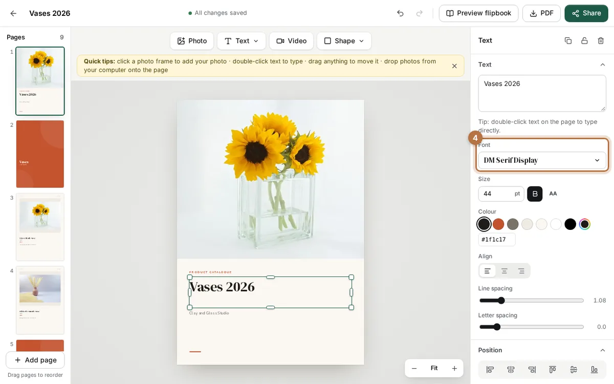
Sometimes you want one word to look different. Click that text on the page. The panel changes to Text.
Use the Font box there. It changes only this text. The rest of your catalogue stays the same.
Do this rarely. Too many different fonts look messy.
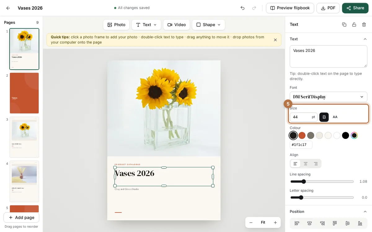
Step 5: Check the size
Still in the Text panel, look at Size. The number is in points (pt). A bigger number means bigger letters.
Our cover title is 44 pt. Product names and prices should be easy to see on a small phone screen. If you have to lean in to read a line, make it bigger. You can also click B for bold, or AA for all capitals.
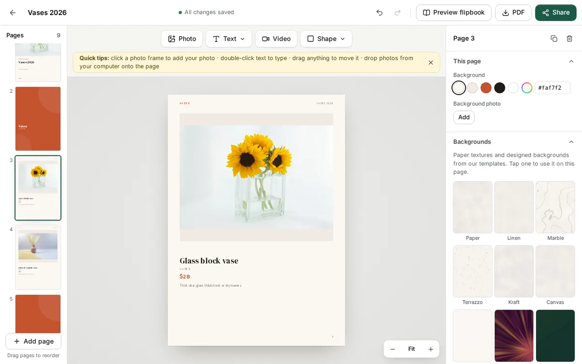
The finished page
Here is a product page after the change. The name uses the heading font. The price and the note use the plain body font. Nothing fights for attention.
When you click PDF, the fonts are saved inside the file. Your customers see the same letters you chose, even if their phone does not have those fonts.
Tips for good catalogue fonts
- Use two fonts only. One for headings, one for the small text.
- Do not use the script font for prices. Numbers in curly letters are hard to read.
- Avoid all capitals for long lines. Use AA only for short labels.
- Keep the same fonts on every page. Use Catalog style, not one text at a time.
- Look at the page small. Your customers read on a phone.
Want a quick start? Open a ready design from catalogue templates. Each one already has a pair of fonts that work together. You can also read 8 product catalog ideas you can copy today for page layouts.
Ready to try? Open CatalogLeaf, make your catalogue free and pick your two fonts.