Restaurant menu card design, taken apart line by line
Good menu card design for a restaurant answers a guest's questions before they ask. Our free one-page card held nine dishes under a one-line note, and a tenth dish ran into it.
"Is the pesto pasta vegetarian?" A guest asks while your only waiter carries three plates. The answer should already be on the table.
This guide to menu card design for restaurant owners takes one free menu apart. We built it in the Irani Café design for Olive Row Bistro, a made-up neighbourhood restaurant with seven dishes. Then we looked at each part in turn.
The top line: name and number
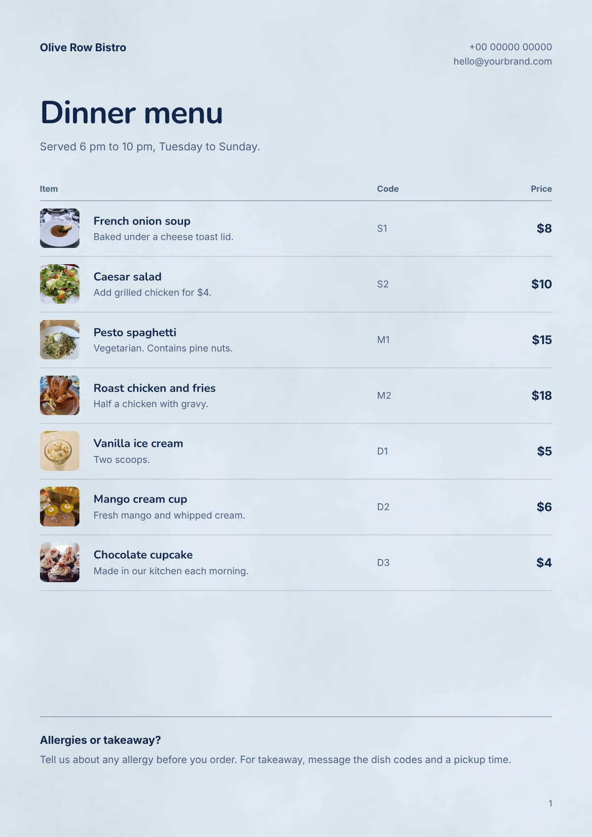
The restaurant's name sits at the top left. The phone number and email sit at the top right, in small grey text.
Guests at the table rarely read this line. It matters when guests take the menu home, or forward a photo of it for takeaway. So use the number you answer during service.
The title and the line under it
"Dinner menu" is the biggest text on the page, at 32 points. A point is a unit of text size.
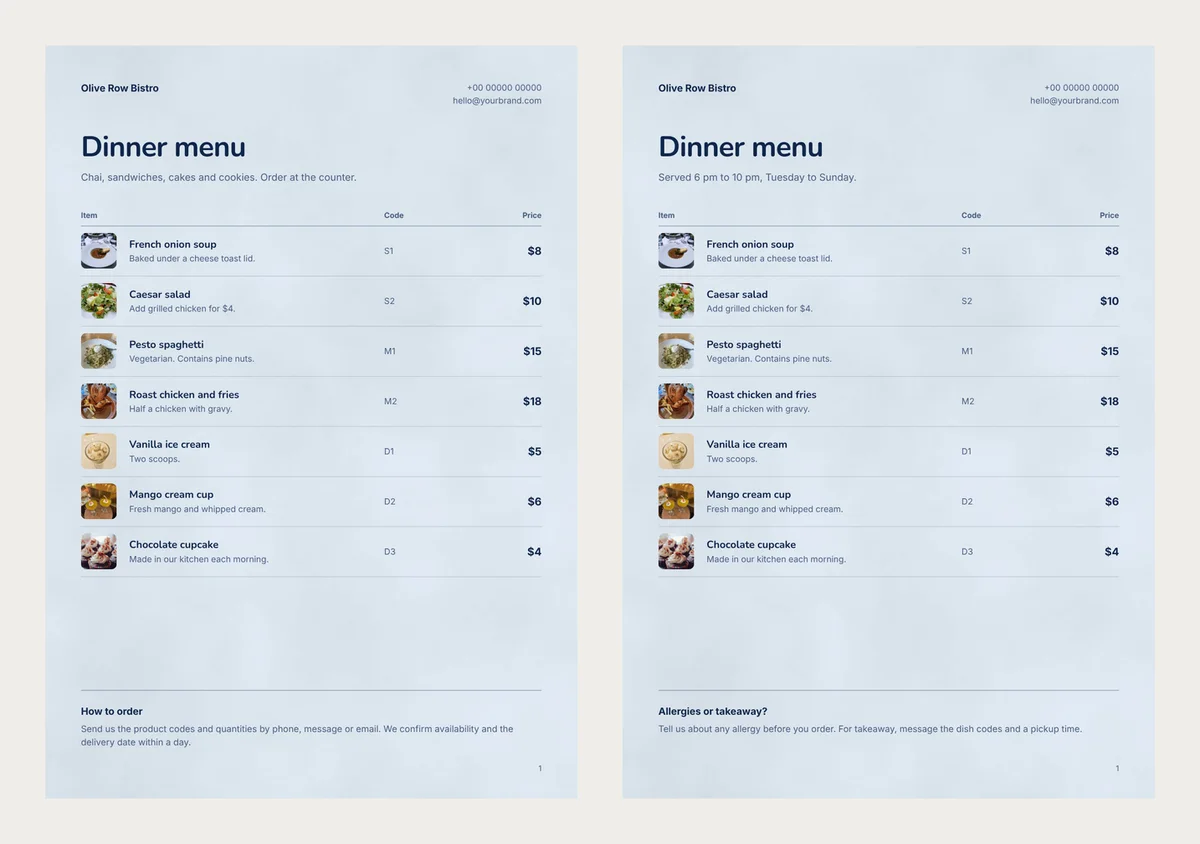
The line under the title came with the design. It said "Chai, sandwiches, cakes and cookies. Order at the counter." That suits a café, not a bistro with table service. We replaced it with our opening hours.
Read every small line before you print.
What goes under each dish name
A row holds a small photo, the dish name, one short line and a price. The name is 11.5 points. The line under it is 9.5 points, in grey.
Use the short line for the question guests ask most about that dish:
- Pesto spaghetti: "Vegetarian. Contains pine nuts."
- Caesar salad: "Add grilled chicken for $4."
- Roast chicken and fries: "Half a chicken with gravy."
Skip words like "delicious" or "famous". A guest cannot check them, and they push out a fact the guest needs. The design shows just one line under each name. A longer line is cut short, so check each row on the finished page.
A photo for every dish
This design keeps a photo square in every row. A dish without a photo gets a plain white square instead. One or two white squares among real photos make the menu look unfinished.
We had a photo for each of our seven dishes. If you are missing a few, take them before dinner service, by a window. Use the same plate and angle each time, so the photos look like a set.
Sections hide in the code column
This design prints no headings like "Starters" or "Desserts". So we used the code column. S stands for starters, M for mains and D for desserts.
Guests will not guess the letters, so add the key to the line under the title. Put the dishes in the order people eat them. When you type your dishes, the Move up and Move down arrows change the order. The code helps with takeaway too. A guest can message "S2 and two M1, pickup at 7:30", and the kitchen knows the order at once.
Prices in one column, as whole numbers
Prices sit on the right, in bold 12-point text. A guest can run an eye down the column and compare.
We wrote "$8", not "$8.00". The zeros add nothing for the guest. Extras go inside the dish line, as on the Caesar salad, so the column holds one price per dish.
The note at the bottom
The design ended with a "How to order" note about product codes and delivery dates. It was written for a shop that delivers. We changed it to "Allergies or takeaway?" and two short sentences.
Do you need calories on the menu? In the US, the FDA menu labeling rules cover chains with 20 or more locations. A single bistro like ours is not one of them. Rules differ by country, so check with your own food authority.
Nine dishes fit, ten do not
We added dishes one at a time, in the same design on A4 paper. Our bottom note was one line long.
- 7 dishes: our menu, with space to spare above the note.
- 9 dishes: still neat. The last row ends just above the line over the note.
- 10 dishes: the last row ran into the note.
- 11 dishes: the menu became two pages, with one dish alone at the top of page two.
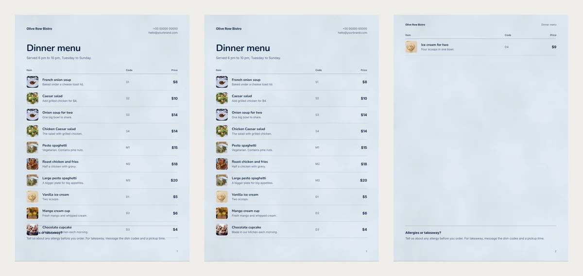
So stop at nine for a one-page card. A two-line note takes one row of space, so then stop at eight. With more dishes, the same table runs on to a second page. Fill that page too, or cut dishes until one page is enough.
Build it in the Irani Café design
- Open the free Irani Café design and choose Use with my photos.
- Add a photo of each dish.
- Type each name, price, short line and code.
- Click Next: choose a design, then Create price list.
- Double-click any sample text on the page and type your own.
For warmer colours, see our six bakery menu cards. They use the same rows, so this advice works in each of them.
If your list still runs to ten dishes, cut the one nobody has ordered this month.
Turn your products into a video New
Pick a design, add your words and photos, and watch it play: made for WhatsApp Status, Reels and Shorts.