
Same 8 products, two books: lookbook vs catalog
A lookbook makes three or four products look their best, and the rest get small. A catalog gives every product the same fair space. For most small shops, start with the catalog.
A lookbook sells a feeling with a few big photos. A catalog helps a customer find and price everything you sell.
To see what that means on paper, we built both from the same product list. Saltgrass Supply is a made-up summer accessories shop with eight products. Prices run from a $12 zip pouch to a $120 leather weekender bag. Its customers see the stall at a beach market, then order on WhatsApp.
We used two free designs in CatalogLeaf, the tool on this site. Both books came out at six A4 pages.
The difference in one table
| Lookbook | Catalog | |
|---|---|---|
| Main job | Make people want the new season | Help people choose and order |
| Products with a big photo | 4 of 8, counting the cover | All 8, at the same size |
| Photo size for most products | 87 × 37 mm, in a list at the back | 87 × 87 mm, four to a page |
| A page about the shop | No | Yes, page 2 |
| Pages for our 8 products | 6 | 6 |
| PDF size, Compact / HD | 814 KB / 1.7 MB | 697 KB / 1.8 MB |
We measured the photos on the finished PDF pages. An A4 page is 210 mm wide, so 87 mm is a bit less than half of it.
Both books showed a name and a price for every product. The page count and file size hardly changed. What changed is which products got the space.
In the lookbook, three products get a full page
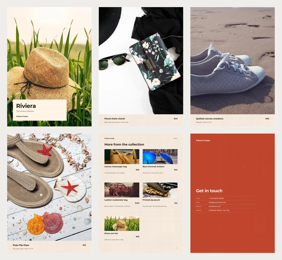
Our lookbook design, Riviera, put the first product on the cover. For us, that was the straw hat.
The next three products each got a page of their own: the floral clutch, the canvas sneakers and the rope flip-flops. Each photo was 210 × 267 mm. That is the whole width of the page and nine tenths of its height.
The other five shared one page, "More from the collection". The canvas messenger bag, the aviators, the weekender bag and the zip pouch were there. So was the hat again, this time with its price. Each got a strip of photo 87 mm wide and 37 mm tall.
About 17 of those strips would fit into one full-page photo. So put your best piece first, for the cover. Put the next three you most want to sell in places two to four.
In the catalog, every product gets a fair square
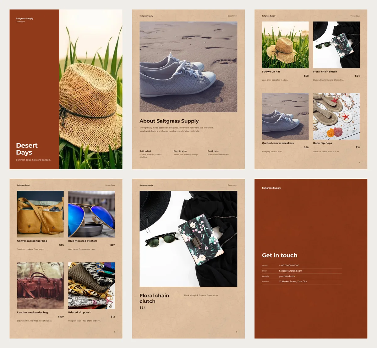
The catalog design, Desert Days, also opened with the hat. Then came an About page, two pages of products and a contact page. Each product page held four squares of 87 × 87 mm, with the name, the price and one short line under each.
The $120 weekender got the same square as the $12 pouch. That is fair to a customer who came for the pouch. Nobody has to look through big photos to find the price of a small item.
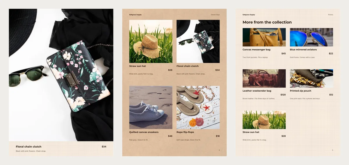
The catalog also gave one product a page of its own, near the end. It chose the clutch, the second item on our list, at 181 × 178 mm. The third photo, the sneakers, appeared again on the About page.
Upright photos suit a lookbook
All our photos were wider than tall, like most phone photos taken sideways. A lookbook page is tall. To fill it, the design cut off the sides.
On the clutch page, only about half the width of the photo showed. The sunglasses at the edge were cut in two. The flip-flops photo was closer to square, so about 70% of it stayed.
For a lookbook, hold the phone upright when you shoot your star pieces. The catalog squares cut less: two thirds of the clutch photo stayed.
Which one for your shop
Choose a lookbook when a new season or a small collection is the news. It works best with three or four pieces you are proud to show big, in upright photos of the product in use.
Choose a catalog when people buy from your whole range. A customer who wants the $18 flip-flops should see them as clearly as the $120 bag. Plain product shots on a table look fine in its squares.
Our pick: start with the catalog. It shows every product at a size people can judge. Make a lookbook later, once a season, for the pieces you want to sell first.
Make both from the same photos
Open the free Riviera lookbook and press Use with my photos. Add your photos, then type a name, a price and one short line for each. Press Next: choose a design, type your business name, and press Create lookbook.
For the catalog, open Desert Days and do the same. We added the same photos and typed the same lines again. The last button then says Create catalog.
Before you send either book, change three things. The big title on the cover is the design's name. Type your own in the Title box on the design step. The contact page shows sample details, like a 00000 phone number. The catalog's About page has the design's own words about small workshops, which were not true for Saltgrass Supply.
Then press PDF to download the file for WhatsApp or print, or Share for a link. Send the catalog first, and keep the lookbook for the day your new season arrives.
Turn your products into a video New
Pick a design, add your words and photos, and watch it play: made for WhatsApp Status, Reels and Shorts.